Interior Design at Lenz!
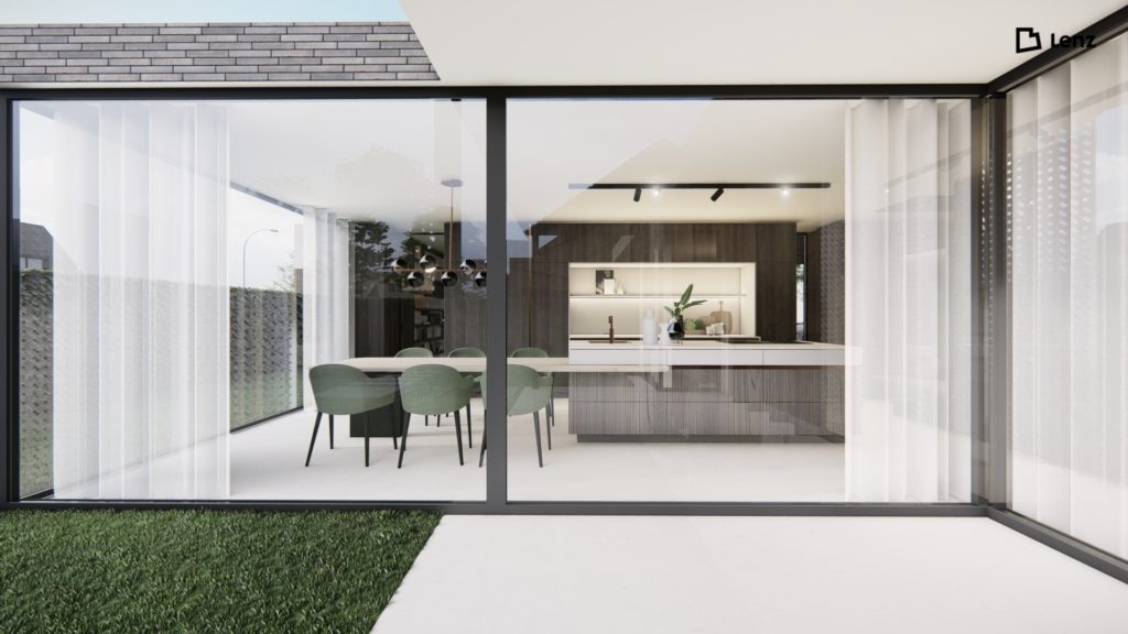
Oct. 25, 2021A design for a spontaneous Brabant couple with two children. After an initial meeting, I had a good impression of their lifestyle and daily doings. The basis, the floor plan of the house had already been considered by André and Tim. The sight and walk lines were already correct, but by making some adjustments to the walls, the interior came out even better. The concept, I use the volume in which the staircase is incorporated as a black box. This black box indicates the routing throughout the house. A connecting volume in which the staircase is hidden. In the hall with a high void, Vescom wallpaper accentuates the vertical line upwards. This wallpaper has a coarse ribbing that creates a beautiful 3D effect on the wall.


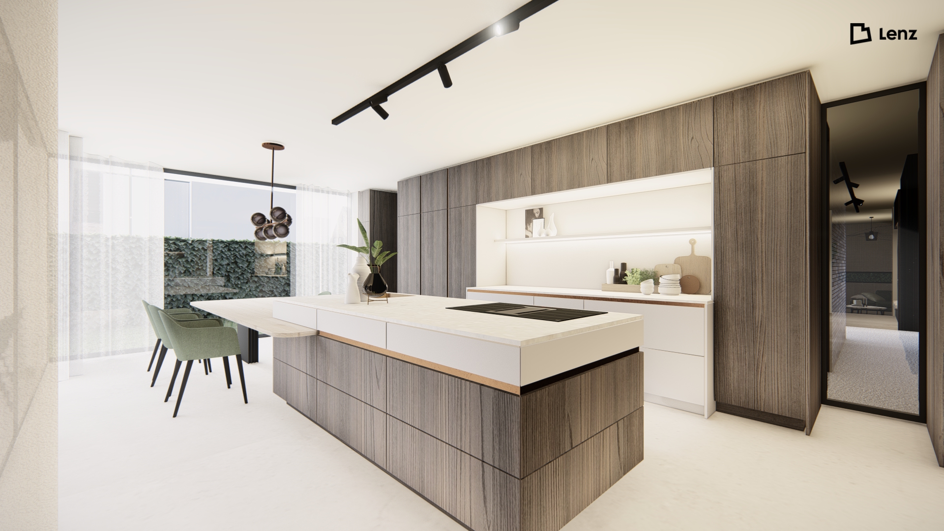
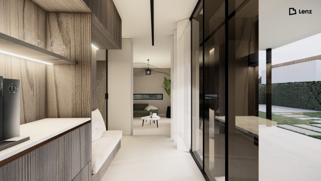
Combining the drawers with a top in the same color tone creates a volume together. The bronze handle frame provides a rich accent. As you walk towards the living room, your eye passes the coffee and whiskey corner with its lovely seating area where you can enjoy the view of the garden. Just around the corner is the children's playroom. Tucked away, but still close by.
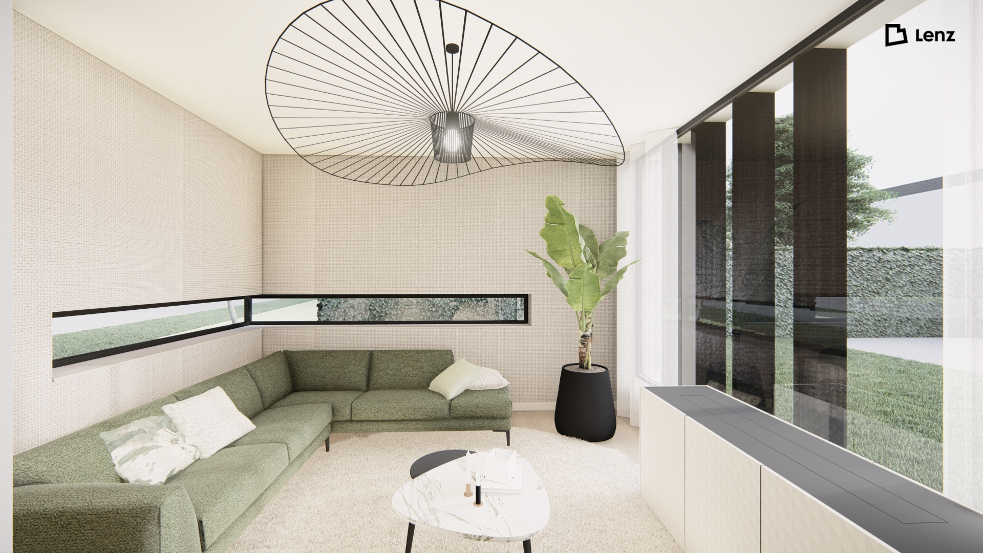
The living room is a subtle nod to a 1970s sitting pit. We didn't want the TV to become the focal point of the room, but the view outside. It is therefore concealed in a sideboard with built-in TV elevator. The walls behind the sofa are covered with a warm wallpaper inspired by a beautiful linen fabric.

